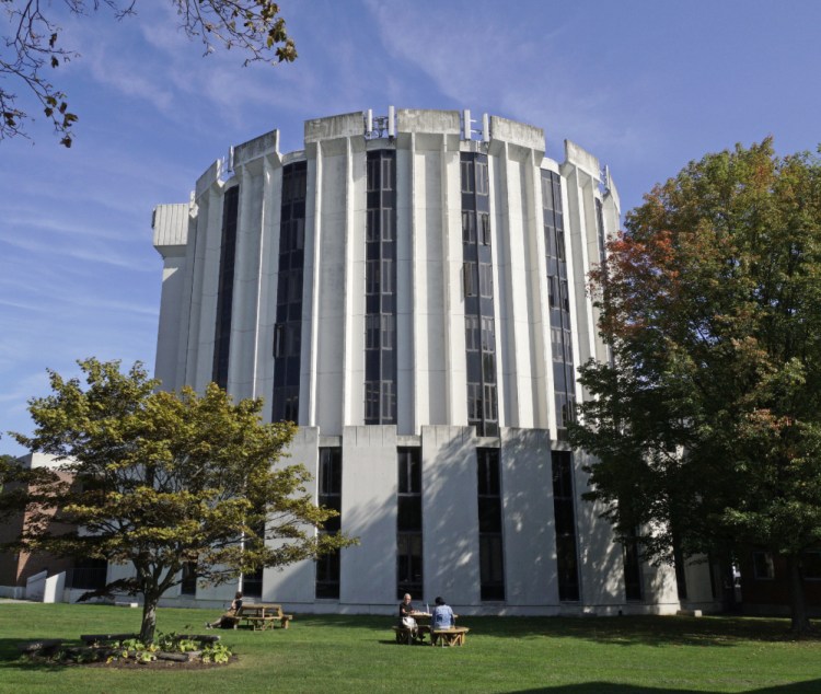
The University of Maine School of Law has three former governors and four Maine Supreme Court justices among its alumni, but its dingy, off-white round, blocky home off Brighton Avenue in Portland is a real stinker, according to Architectural Digest.
“This university building may look like a futuristic version of the Roman Colosseum, but the only battles happening within these walls are with the bar exam,” the magazine wrote in a recent article declaring the building one of the eight ugliest university buildings in America.
Associate Dean for Academic Affairs Dmitry Bam isn’t arguing the point.
“You’ve seen the building,” Bam said with a smile.
The eight-story structure at the intersection of Brighton Avenue, Deering Avenue and Falmouth Street looks like a silo, only wider and with columns of windows spaced between sheets of gray-white concrete. Bristles of cellphone towers and antennae rise off the roof, and a squat, square brick addition looks like a child’s block placed next to a sand castle tower.
Bam, who has worked at the law school for six years, said there are days when he thinks it would be nice to have an office in a traditional brick building overlooking the water, but he doesn’t worry too much about it.
“I think everyone here has just sort of accepted it,” he said. “It’s a joke but also a badge.”
Nicole Vinal, assistant dean for finance and administration at the law school, has worked there since 2005. She called the building “rather unfortunate.”
“But my kids think I work in a castle,” Vinal said. The building was not originally built for the law school. It was commissioned by the University of Southern Maine and housed mostly administrative offices until the law school moved there in 1972 from its former location on High Street.
The building, which cost $2.7 million to construct, has been described as an example of modernism. The “brutalist” style of architecture seen in the building became especially popular for educational institutions, typically seen in large buildings that predominantly featured exposed concrete construction.
The building was designed by the Portland architectural firm of Wadsworth, Boston, Dimick, Mercer and Weatherill, although it’s not clear which architect actually designed it. That same firm, it turns out, had the honor of being involved in the design of Deering High School – which Architectural Digest just named the most beautiful high school in Maine. The firm designed an addition to Deering in 1981.
The law school building isn’t much better on the inside. The basement tends to flood, Vinal said, and visitors tend to get lost in the looping hallways.
Then there’s the actual work space: “Everyone’s office is shaped like a slice of pie,” she said. “You can’t find furniture that fits appropriately.”
Vinal said the law school’s founding dean, Edward Godfrey, is universally revered, except for one thing: moving the law school.
“Most people say that was the only mistake he made,” she said.
The building’s architect apparently was fond of his work. Vinal said the story goes that he used to set up a folding chair out front and just stare at it some days.
Others, though, find it hideous.
“We get hate mail,” Vinal said.
Dean Bingham, an architect who now operates Dean’s Sweets, wasn’t surprised to hear that the law school building made Architectural Digest’s list of ugliest university buildings.
“I think it’s well-deserved,” said Bingham, who lives about four blocks away and passes the building every day.
Back in 2000, when Bingham was considering buying his house, he told the real estate agent he wouldn’t buy it if he could see the law school building from any of the windows. Turns out the building can be spotted from the back window of his attic, but Bingham bought the house anyway.
Bam said a newer, shiny building might help in recruiting students, but he said most Maine Law students are attracted to the smaller class size or to Maine in general. It’s the only law school in the Pine Tree State.
“There has always been talk about a new building and that may happen, but we’re happy to put money into academics,” he said.
Other university buildings on the ugliest list, and the magazine’s commentary:
• Stony Brook Hospital, Stony Brook University: “The black cylindrical glass building paired with a drab stone box looks as if the two were built as separate entities and connected by two throughways as an afterthought.”
• Crosley Tower, University of Cincinnati: “Crafted from a single pour of concrete, this 16-story building looks more like a Disney villain’s lair than a part of the University of Cincinnati’s campus.”
• John C. Hodges Library, University of Tennessee: “Though it was ranked among the top research libraries in the country in 2011, the library’s odd boxy exterior begs for a modern update.”
• Health Sciences Center, Louisiana State University: “The microscopic windows dotting this boxlike structure give this educational hospital a prisonlike appearance.”
• One Western Avenue, Harvard University: “In stark contrast to the rest of its stunning campus, Harvard’s One Western Avenue is a futuristic departure from the norm, highlighting a geometric construction and jagged brick details.”
• Boyd Law Building, University of Iowa College of Law: “Completed in the late 1980s, this shining example of late modernist architecture is reminiscent of another 1970s design: the Death Star.”
• John and Frances Angelos Law Center, University of Baltimore School of Law: “While this building is one of the most environmentally conscious university buildings in use today, its checkerboard design and Tetris-esque exterior earns the John and Frances Angelos Law Center a prime spot on our list.”
Staff Writers Gillian Graham and Noel K. Gallagher contributed to this report.
Eric Russell can be contacted at 791-6344 or at:
erussell@pressherald.com
Twitter: PPHEricRussell
Send questions/comments to the editors.


