

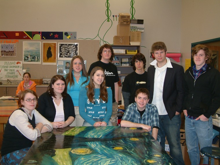
A group of Scarborough High School students have a unique and important role in helping with Scarborough’s 350th anniversary celebration – they are developing the event’s logo.
The students, mostly seniors, are members of Joanne Allen’s design class. All are advanced art students and the logos were a class assignment.
Allen came up with the idea after being approached by a member of the town’s 350th Committee. She thought it would be appropriate because it incorporated two-dimensional drawing and aspects of design theory the class had been studying.
“I thought it was a good project for the kids because it would be for something that would be used,” Allen said.
This is not the first time the class has produced logos. During one segment they created a logo for a fictional moving company. But the fact that the logo will be used by a real organization has made the project more interesting and fun.
“You definitely put more thought into it,” said student Ali Runca.
Students focused on different aspects of Scarborough while designing their logo. Jordan Chase said the first thing that he thought about Scarborough was the marsh so he incorporated a marsh into his logo. The same thought process held true for Zach Thomas, who used the Town Hall in his design.
“The hardest part was finding something that represents the town because there’s so much to Scarborough,” Runca said.
The students used two different approaches while designing their logos. Some drew them by hand and then scanned them into a computer where its size could be manipulated. Others drew the logo directly into a computer using a number of different programs, including Photoshop and Illustrator.
All of the logos were submitted to the 350th Committee. The committee selected five designs that they liked and gave them back to the class for further refinement.
Students expect that it will be easier to create the new logo because they have received more direction from the committee. For example, the committee liked the circle from one design, and a building that was incorporated in another, while it also liked the wording from a third.
In addition, the committee has further developed the guidelines for the logo and would now like to see the town’s founding date (1658) and the anniversary year (2008) be included in the logo. It also will have to include the current spelling of Scarborough, rather than the older spelling of “Scarboro.”
But it still will be a challenge since the logo will have to incorporate many of the aspects the committee wants while remaining simple and easy to identify, and usable in various sizes ranging from a coin to a T-shirt.
“We’re trying out how we can combine these things and fit them in,” Allen said.
The project also is giving the class a chance to create something in a collaborative environment, something that they normally do not have the opportunity to do, Allen said.
This is not the first time that Allen’s class has worked on community projects. In the past they have designed the logo for the Lobster Classic, drew a mural for the fire department and, last year, painted a newspaper box for the Portland Press Herald, which remains on display in front of the newspaper’s office in Portland.
“We like to be tied into the community that way,” Allen said.
 Scarborough students designing 350th logo
Send questions/comments to the editors.
